Color
Triadic Color Schemes: The Designer-Approved Secret to Stunning Palettes
Mastering Color Balance with Triadic Color Schemes
What Makes Triadic Colors Stand Out?
Triadic color schemes use three hues spaced evenly around the color wheel to create bold yet harmonious designs. This approach brings a lively, balanced effect that works well in any room. Whether you love bright colors or want a refined palette, triadic tones offer endless combinations.
How to Use Triadic Colors in Interior Design

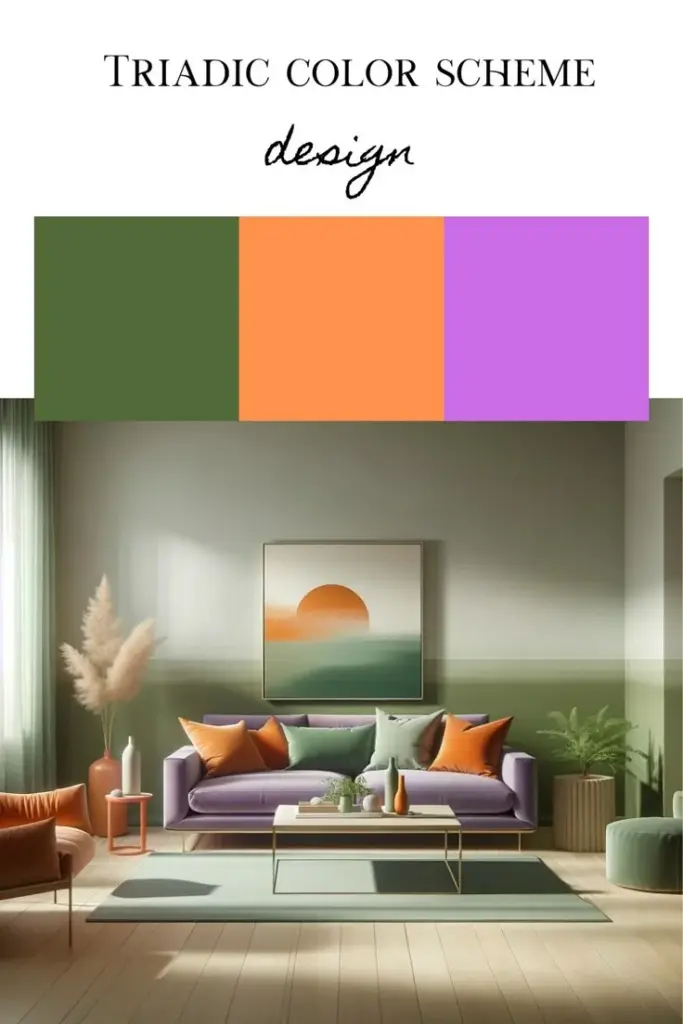
Designers love triadic palettes because they add depth and variety without clashing. Start with one dominant color, then add two accent hues. This method works in living rooms, bedrooms, or even small office spaces, giving them vibrant personality without visual chaos.
Tips for Choosing the Right Triadic Palette

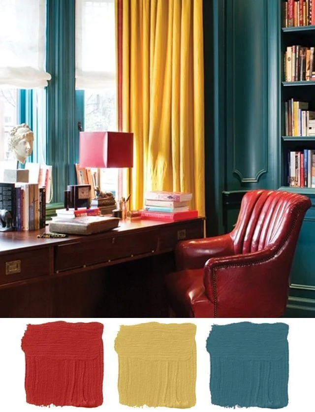
Select colors that match your space’s mood. For playful energy, choose brighter options like coral, turquoise, and lemon yellow. For something more soothing, opt for muted versions like moss green, brick red, and deep gold. When applying triadic color schemes, balance each hue carefully to avoid overwhelming the space.
Mix and Match with Confidence
Even subtle shades like mint, blush, and mustard can form a triadic combo. Always test swatches under different lighting conditions to see how each color behaves. Then, mix finishes and textures to add dimension.
Triadic color schemes offer creative freedom with structure. Use them to transform your home with bold harmony and unique style.
**Craving more design insights and home decor inspiration? Explore ****more **creative ideas now—only on our website!