Color
These 4 Colors Are Poised to Redefine Traditional Neutrals

Traditional neutral colors like black, white, and gray have long been staples in home design. However, four new shades are making waves and proving that neutrals don’t have to be boring. These colors are subtle enough to serve as the foundation of any room, yet they bring a fresh, modern twist to traditional color schemes.
What Are Neutral Colors?
Neutral colors are hues that lack saturation and aren’t included on the color wheel. They act as balancing elements in design, supporting brighter, more saturated colors. Neutrals often change their appearance based on lighting—what looks cool in daylight might appear warm in artificial light. Classic neutral colors include white, beige, gray, and black.
The 4 “New” Neutral Colors
These four colors may not have traditionally been classified as neutrals, but they’re becoming go-to shades in home decor. They’re subtle enough to serve as the foundation of your design while providing a modern, sophisticated vibe.
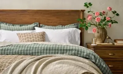
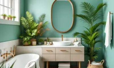
- Sage Green
- Why It Works: This gray-green hue brings a calming, natural energy to any space. It pairs well with other neutrals like cream and brown, as well as brighter hues like yellow and blue.

-
- How to Use It: Swap out ivory or white for sage green, especially in spaces like kitchens or bedrooms. Try painting kitchen cabinets or updating your bedspread to give the room a soft, organic feel.
- Blush Pink
- Why It Works: Blush pink adds warmth and softness, making it an excellent alternative to traditional neutrals like cream and ivory. It’s currently trending thanks to movements like cottagecore and Barbiecore, and its versatility has staying power.

- How to Use It: For a subtle introduction to this color, swap white or ivory walls with blush pink. If you’re hesitant to make a full commitment, start with accents like throw pillows or an accent chair.
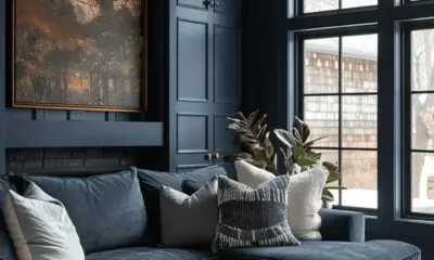
- Navy Blue
- Why It Works: Navy blue is a deep, rich color that serves the same purpose as black or brown but with more personality. Its versatility allows it to complement various design styles, from traditional to coastal.

- How to Use It: Use navy blue where you’d typically opt for black or brown. Paint trim or accent walls for a bold yet calming effect, or use it as the primary color for walls to create a serene backdrop for artwork.
- Olive Green
- Why It Works: Olive green is a deeper, earthier tone that brings warmth to a space. It pairs beautifully with other natural tones like terra-cotta and brown and works as a softer, warmer alternative to black.

- How to Use It: Olive green makes a striking focal point when used on large elements like a fireplace. Incorporate it with smaller accents such as throw pillows, chairs, or houseplants to add depth and interest to a room.
Conclusion
These new neutrals—sage green, blush pink, navy blue, and olive green—offer more color variety and warmth without compromising on versatility. They pair seamlessly with existing neutral tones and provide an updated, contemporary alternative to traditional color choices. Whether used on walls, furniture, or accents, these shades will help redefine neutral tones in 2025 and beyond.

